Fun with Black Paper 3: Van Gogh Watercolor Set and Paper

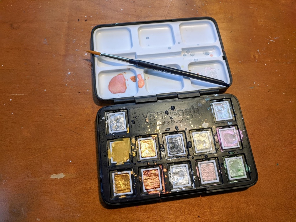
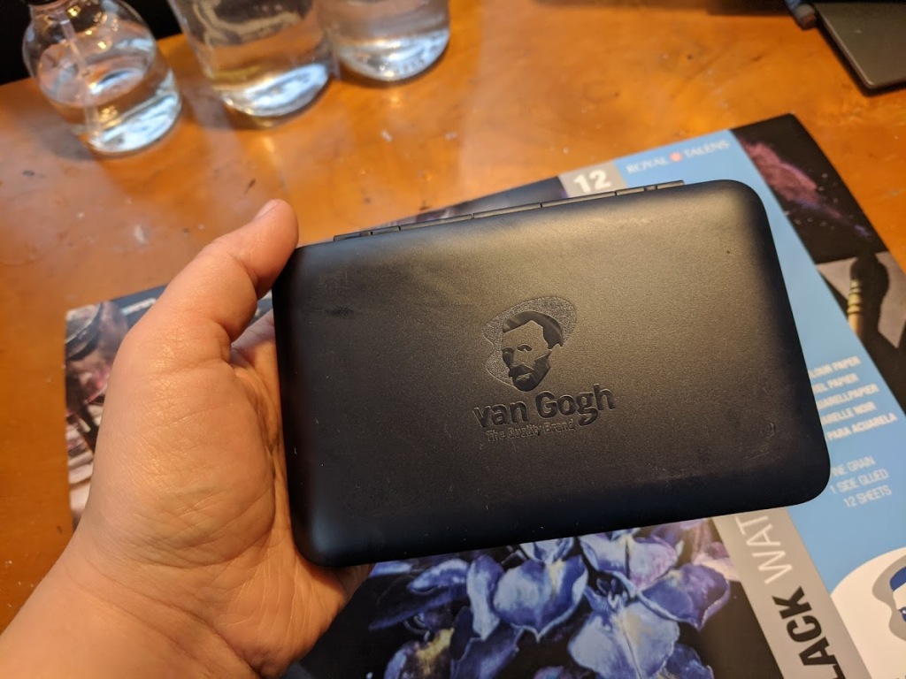
Due to my ongoing obsession with black paper, I decided to give a new brand (to me) a try Van Gogh watercolors. I picked up the Specialty Set of Metallic and Interference Watercolor (I paid $55, but its $45 at Cheap Joe’s right now) and a 16.5” × 11.7” black paper pad ($25). Made by the Dutch company Royal Talens. Van Gogh is their “student and artist” line.
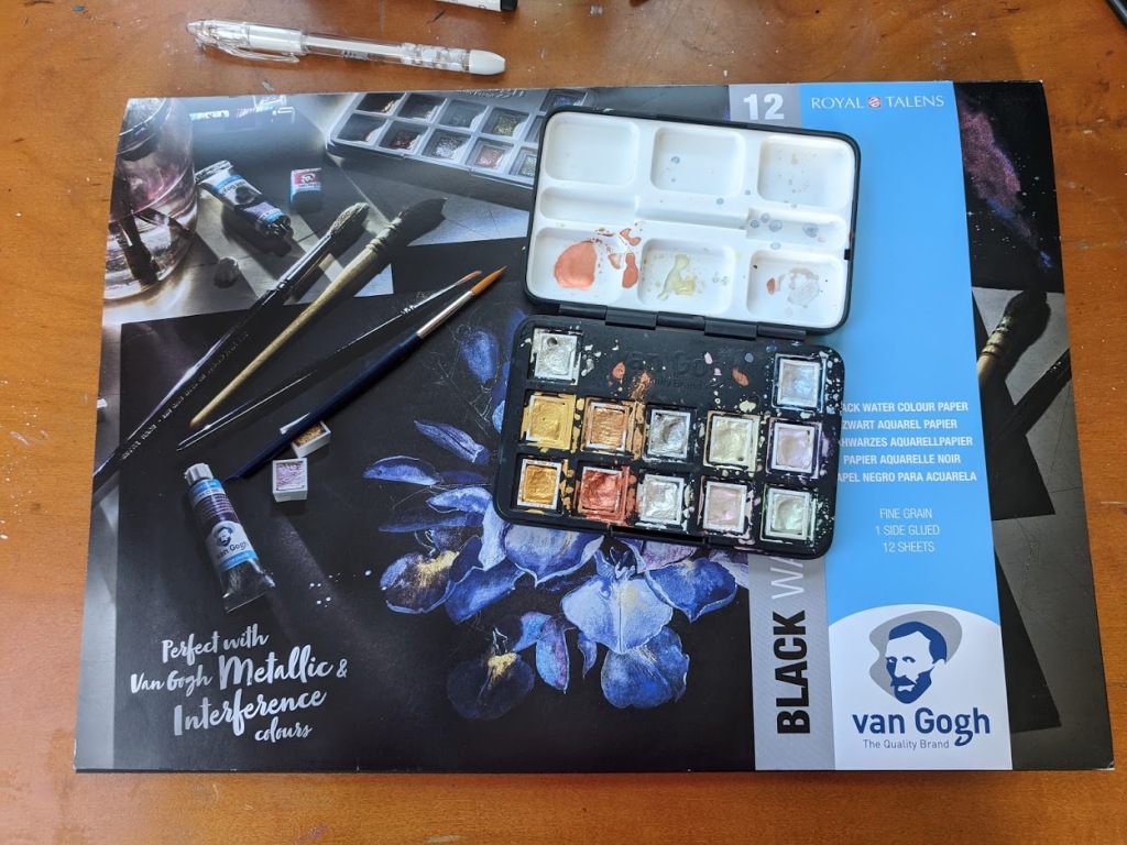
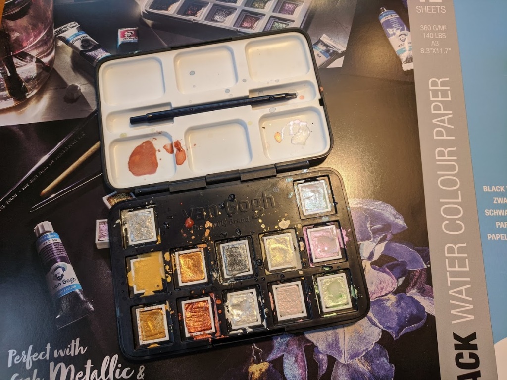
I can never remember to take photos before I start using a new set.

I am generally not a fan of student grade watercolors with a few exceptions. Many are so low pigment and so tricky to work with it can take the joy out of a painting. While others are fine for practice if you don’t need your piece to be lightfast. I have student grade paints I use for pieces I intended to scan and turn into digital art because, for that purpose, lightfastness is moot. Outside of that, I generally tend to stick with professional-grade paints. But, the Rembrandt Special Effects pallet is very expensive at the $100 price point and did not seem worth the investment for what amounts to experimentation on my part at this point. But, I am contemplating picking up the Rembrandt specialty colors in tubes, especially the glass-based paint in the future, which seems to be a better value than the set.

The Van Gogh set comes in a plastic box with a mixing palette and a travel brush. The pans are removable and come individually warped so you can order refills of your favorites. I know, given this is a student grade, I should expect plastic, but I find this kind of plastic case hard to travel with as I can’t use magnets to hold the pans in place nor the clips you see in some metal cases. I like that the case is black, but I wish this was also true for the included mixing palette, which is white. It is tough to see the colors of the interference paints on white.

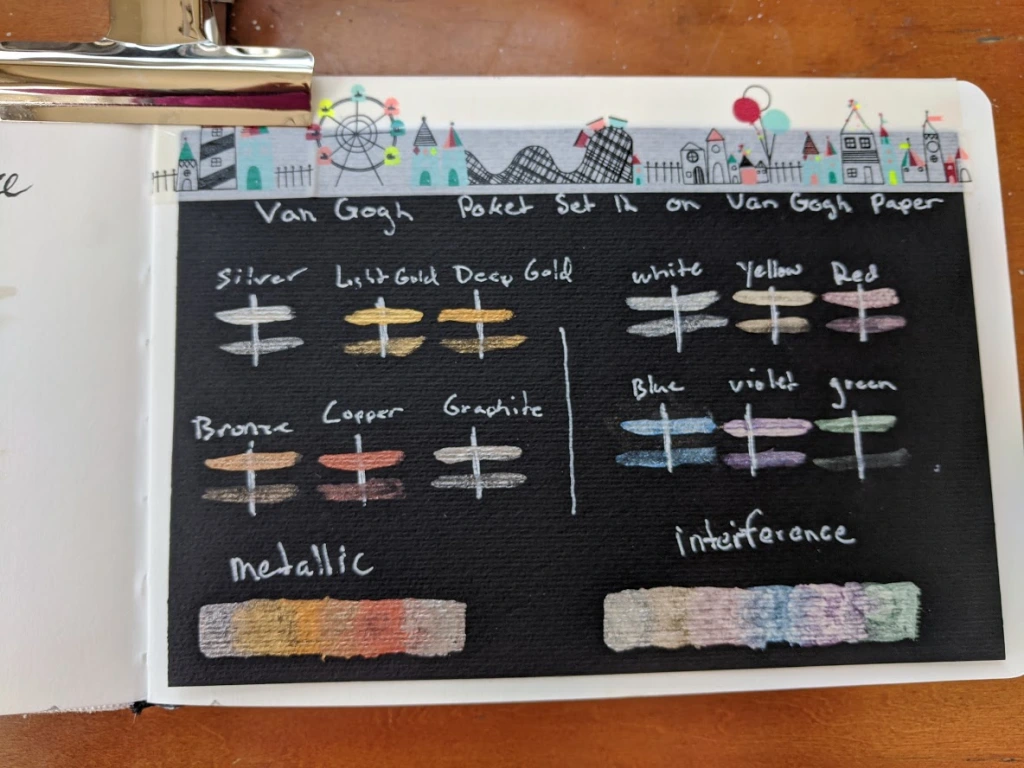
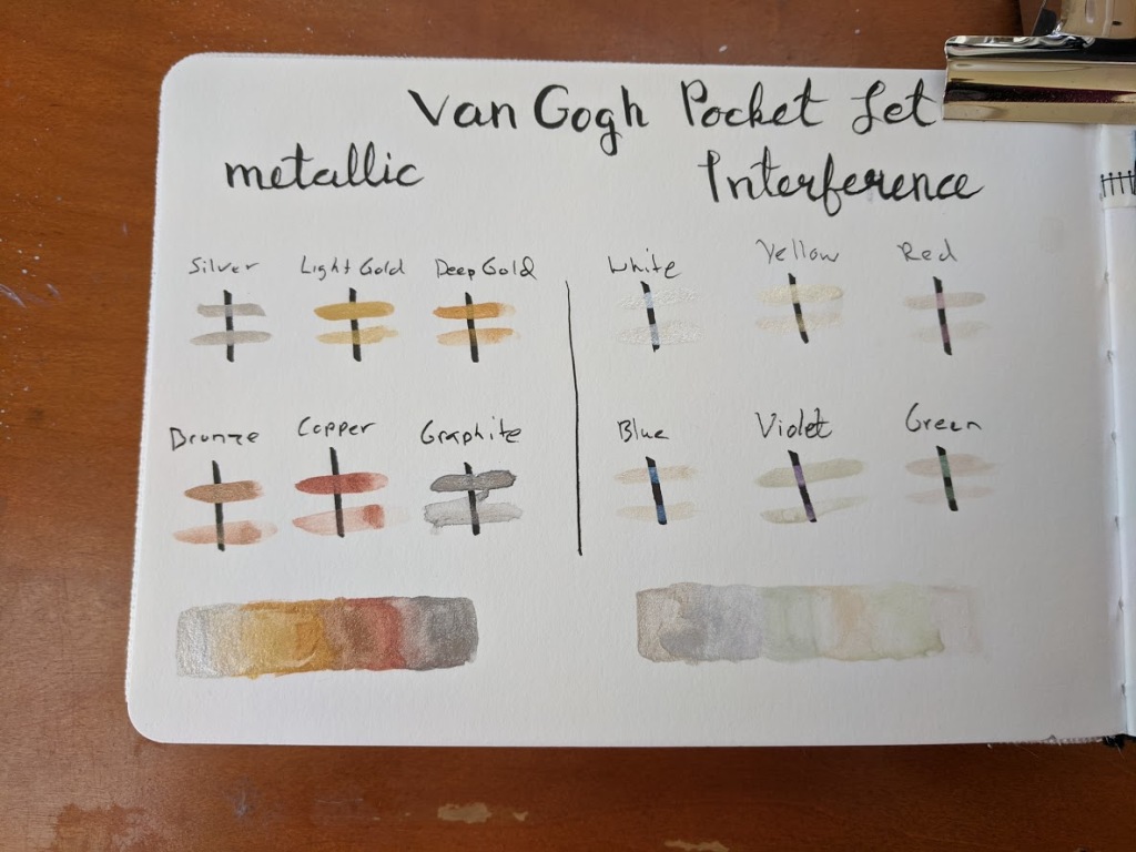
For student grade paints, these are relatively pricey, but I think they are good quality student paints. I would put the metallics on the same level as the beloved Finetec brand for opacity. They would make excellent brush calligraphy paints. The interference behaves differently than I was expecting. I have used interference acrylics before, and the color shift between colors when viewed from different angles. The mic coated particles shift between an opalescent color and its complement. Such as red to green or yellow to purple. The watercolor Van Gogh interference paint shifts from white to colored. But are still very pretty, and I can see applications for feathers, scales, and other iridescent features. The interference paints really pop on black paper and give subtle sparkle on white. They do not scan well, however, and the camera really does not do them justice either.
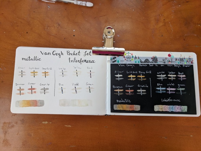
 

I decided to try to paint an illustration with just this set, which was rather tough, and I did end up falling back on my white and black pens for details after.
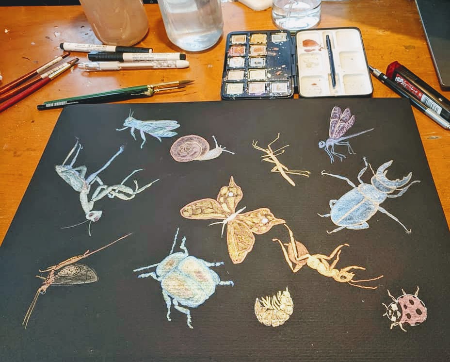
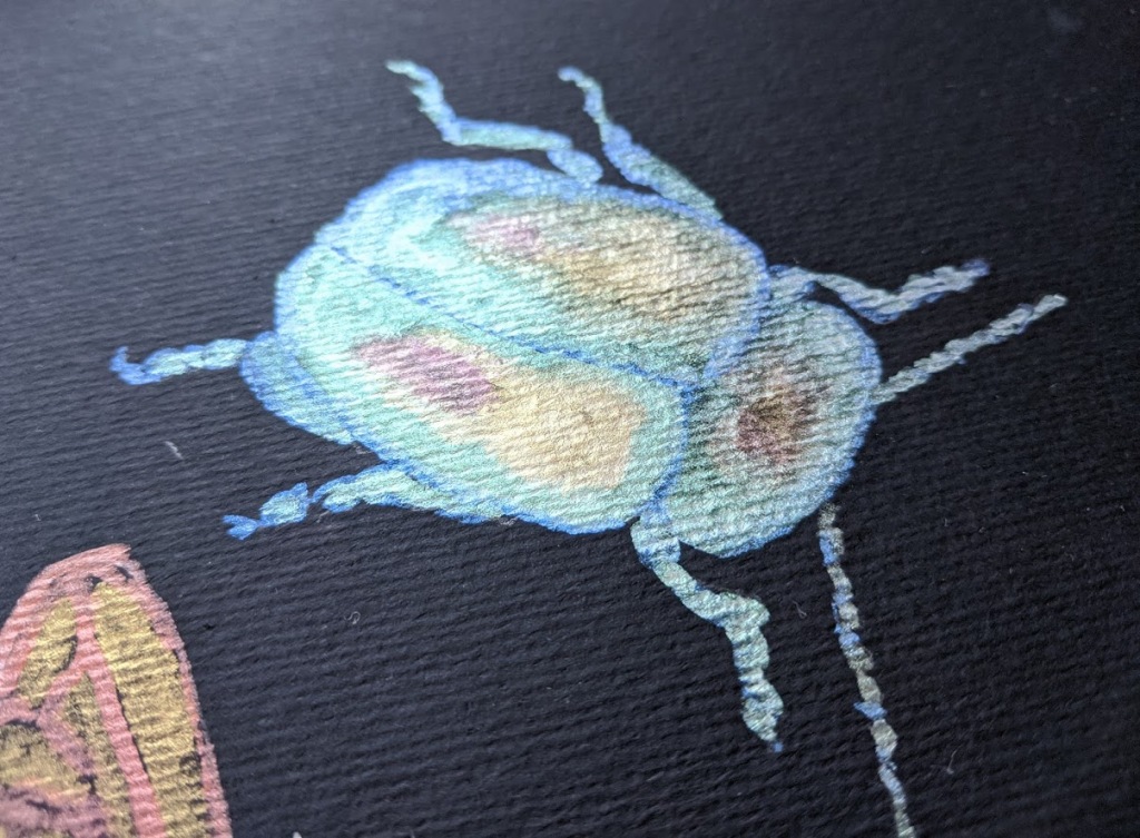
They worked much better for me as part of a mixed media piece with gouache, ink, and Finetec watercolors.
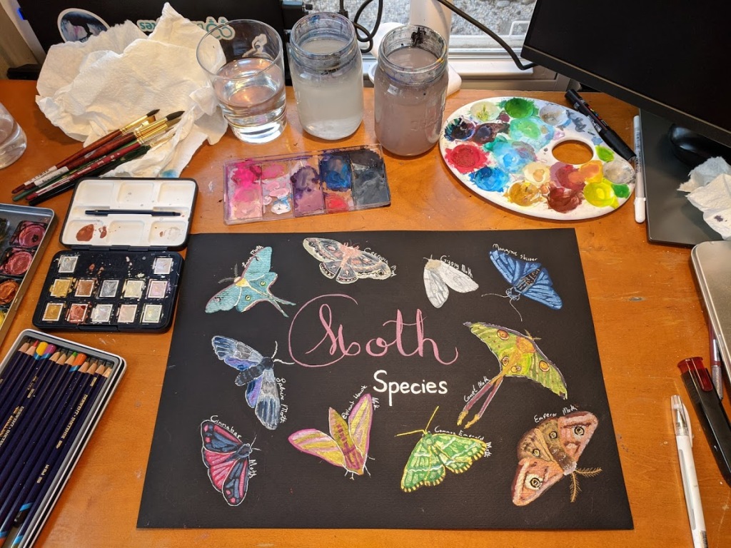
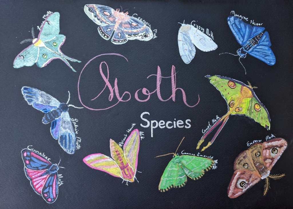
As for the paper, it is 140 lbs and is a reasonably decent watercolor paper. It will only buckle if you get it sopping wet but will then dry flat. It works excellent for brush calligraphy and illustration. The only drawback is both sides are rough, so for dip pen calligraphy, the Stonehenge pad is a better option. Overall I would say using these supplies was a pleasant experience, and I will defiantly experiment with them more in the future.

Happy Art Journey,

Justine
Fun with Black Paper Part I

Way back in late December, my 2020 January Sketch Box had a sample pad of Stonehenge black watercolor paper. This is a medium weight paper at 140 lbs with a typical water paper bumpy surface. But it is not bumpy enough to be called rough. The description does not say cold-pressed but that is how I would describe it. I have purchased black art papers in the past including a black Moleskin sketchbook and Carson XL drawing pad but both were rather low weight and meant for dry media not wet. I also have a heavier weight Strathmore Black Mixed Media pad at 140 lbs but the surface is rather smooth like drawing paper. I do like a sopping wet watercolor style and generally buy 300 lbs in watercolor papers this Stonehenge paper is not a good paper for that style. As you can see on the butterfly below the paper did start to buckle a bit with the heavy application of green gouache.

But I find 140 lbs fine for illustrations with ink and watercolor. I was very intrigued by the unique properties of this paper. I set out to create something using what had come in that box. I had a blast with the contents and this was my all-time favorite box.

I also have some gouache I purchased for an online illustration class that I have hardly touched in the last year or so. Gouache just pops on this paper. I have a new fascination with the media because of this paper. I also love metallic, interference, and mica based paints and ink which are really striking on this paper. If you own Finetech pearlescent paints give them a go on this paper you will love the results! This sent me on something of a black Stonehenge pad buying and painting spree.

I started with space illustrations because black naturally makes me think of space. Below are a few of things I painted last month.

Solar System Illustration
Nebula with Finetech Paints.

Next, I think I will move on to the ocean and deep ocean creatures as this seems a fitting subject for black paper.

Happy Art Journey,

Justine

Thoughts, on Boutique Watercolor Paints and a Greenleaf and Blueberry Review.

A few months ago I purchased two small 1/2 pan pallets from Greenleaf and Blueberry a maker of handmade watercolor in Colorado. As I have mentioned in my Hushwing watercolor paint review back in March I have been very interested in boutique watercolors as an alternative to mass-produced watercolor paint for a while. Don’t get me wrong mass production has in many ways change our lives for the better. Productivity is greatly improved and standardization makes some things easier to fix and implement. I am not a Luddite. I certainly don’t want to go back to producing all of my own furniture, food, or building my own home by hand. (If you are that sort of person who does then your awesome!)  However, there are several drawbacks to mass production. The standardization required for mass production means we are left with what the big guys think we should have for art supplies and that limits availability of alternative formulas.  Very little of what we pay for an item goes to the persons who helped create it in a factory. There are very real drawbacks to all of the cheap mass produced stuff populating our local big box store in the form of wealth disparity.  For this reason, I like the idea of paying the artisan paint maker directly for their wears.

It seems that I am not the only one who feels this way as several boutique watercolor makers have come to the market in the last few years. An Etsy search for “handmade watercolor paint” will now return dozens of sellers offering this type of product with hundreds of listings. Popular makers like Greenleaf and Blueberry often sell out within hours of listing their products for sale. Companies like Natural Earth Paint, Earth Pigments, and Kremer offer those willing to make paint a wide range of available pigments.

Greenleaf and Blueberry were one of the first such companies I have heard of. Originally a few things have kept me from purchasing their paints. One if you really want them you have to watch for their newsletter and then stalk the store the day of the listing. I got lucky one day and saw the newsletter in my inbox on their listing day about 5 minutes before this listing and navigated over for a quick purchase. I am just not the sort of person who can ‘stalk’ for a purchase I just don’t get that excited about stuff.  If it was going to happen it would take the magic combination of me having spare cash, time, and looking at the right computer interface at the right moment. Which is what happened. Two they are very pricey. I mentioned in my previous post on this topic why such products cost so much. It is a combination of highly pigmented paints, hand mulling, hand pouring, and hand packaging. See a theme here? Labor in the United States is expensive and the creator has to make enough to cover material costs plus their time.    Finally, there are just so many other paints out there for me to try! I didn’t really feel I was missing out by not getting my hands on these products. But, in the end, I am glad I made this purchase and would be interested in owning more.

Okay, on to my thoughts on these paints. I like them. I purchased two pallets the Primary Mayan Primary Trio and the Mineral Trio. They are both highly pigmented and provided excellent coverage. They are packaged in small Altoids type tins with magnets at the base of each half pan. The packaging is well done however I neglected to take an initial photo when they arrived. So all I have to share is this shot which I took after several uses of each pallet.

Greenleaf and Blueberry

scullentsinpotts
Succulents in clay pots using both sets.


The Mayan Primary Trio features Mayan Red, Mayan Yellow, and Mayan Violet. I purchased this because I find the story behind Mayan pigments interesting. The techniques of mixing organic plant pigments with clay were lost but have recently been reconstructed. The red reminds me of Madder Lake dark red with the look of fresh blood. The yellow is a bright yellow that leans toward the cooler side.

Mayan
Swatch Mayan Trio Green Leaf and Blueberry watercolors

I now wish that I opted for Mayan Blue over Violet as that is the color of real historical interest to me. But, the violet is a fine shade. Mayan Blue is perhaps the best known of the Mayan colors as blue has historically been difficult to obtain and expensive pigment. Until the development of French Ultramarine, the goto mineral for blue in Europe was ground lapis lazuli. What makes Mayan blue such a stand out is there are Mayan paintings that still have a radiant blue to them.

Bonampak_mural._Room_1._Musicians_and_dancers
Fresco from Bonampac, room 1, fragment of the northern wall. 790th.


The Mineral Trio includes Pipestone, Malachite, and Vivianite, The mineral set does handle very differently from other watercolors I have used. It does take some getting used to. Glazing techniques can be tricky as these paints lift very easily.  They add a gritty texture to the surface of the paper once dry.  I am still not sure how to best apply these in my paintings but it has been fun to explore their behavior and experiment with them.  The Pipestone is reminiscent of clay garden pots. The Malachite is a cheery and tropical green-blue. Vivianite is a dark nearly black blue gray that reminds me of soil.

Mineral Trio
Mineral Trio Swatches Greenleaf and Blueberry watercolor

img_20180628_192349_324

My assessment of these paints is largely the same as the Huswing watercolors I reviewed back in March. Not a necessity but a very nice luxury item to have if you can afford it.

Happy Art Journey,

Justine

Hushwing Dot Card Review

The last half-decade has seen the launch of several boutique watercolor paint business run by artisans. Some of these boutique watercolor paint makers utilize hand mulling, high pigment ratios, and ‘natural’ ingredients to differentiate themselves from the big paint makers. As a result, many are offering unique, handmade, and exceptionally high-quality watercolor paints.   I have been following some of these watercolor paint artisans via social media over the last year Hushwing, Greenleaf and Blueberry, Letter Sparrow, and Pfeiffer Art Supply to name a few. Many of these businesses carry hard to find pigments or have a unique focus to their paints. For example, Hushwing has a focus on North American earth pigments, Greenleaf and Blue Berry features Gemstone and Aztec pigments,  Pfeiffer Art supply offers a bird themed collection with non-toxic pigments.

Last month I ordered a dot card from Hushwing’s Etsy Store to give their paints a try. Overall it was really a lovely watercolor experience. The dot card arrived carefully and elegantly packaged in nested envelopes. The inner envelope was a striking dark blue color sealed with wax. Everything about the presentation says ‘slow and careful preparation’. The dot card its self is a nonabsorbent type paper possibly YuPo rather than traditional watercolor paper.  I appreciate this as it enables the customer to use the dot card more like a mini paint palette mixing the different pigments without the paint seeping into the paper. I was able to paint a small trial painting which I think gives me a better idea of the paints’ features and quality.

Hushwing Watercolor Paint Dot Card

I picked up the Hushwing Collection which is a mix of earth and one modern pigment including Colonial Yellow Ocher, Colonial Raw Sienna, Colonial Burnt Sienna, Colonial Red, Colonial Violet, Colonial Raw Umber, Colonial Burnt Umber, Cyprus Green Earth, Cyprus Jarosite, Prussian Blue. The earth tones and muted colors of this pallet lead themselves well to forests, mountains, and fields. Making the collection an excellent en plein air (out in the open painting) set. I would like to pick up this set in the near future for summer travel.  Each pigment is hand muled and bound with gum arabic and honey. The Colonial paints are earth pigments from North America. Cyprus Jarosite is an earth pigment that originates naturally from Cyprus. While Prussian Blue is a modern pigment although it dates to 1700s dye makers. Full pigment descriptions are available on the Hushwing Website. This dot card contains my favorite Yellow Ocher and Raw Siena I have used so far and I would buy a set for just them. The Prussian Blue is also exquisite, deep, dark, and intense. The Colonial Violet is a lovely earthy muted purple. Each paint has a very high pigment to binder ratio. I found myself needing more water than expected to dilute the paints to make gradients. The website states Hushwing has a 50/50 ratio which I believe.  Each dot rewetted readably. Paints lifted off the paper well when I wanted to add highlights. Overall it was a very enjoyable set of paints on the card.


Hushwing paint is not low cost which is why I started with a dot card. However, this is to be expected as the artisan Kirsten Cooner needs to recoup the cost of supplies and her time while making a profit that one could live on. Becuase, of the high quality of the paints her production cost is likely high in both money and time. She is clearly not skimping by using more binder, cheaper pigments, or any of the other tricks watercolor producers use to lower production costs. Additionally, the website describes a laborious process of hand mulling and hand poring in thin layers.  A set of ten half pans currently costs $110 and the seven half pan Colonial set is $70. However, at about $10 per a half pan, this is similar to pricing for Schmincke ($7 to $13) the best-known mass-produced premium watercolor paint. Keep in mind I am not a pigment expert and I am an amateur artist. That said I did like using Hushwing paints more than the ones in my Schmincke set.  Hushwing is by no means a necessity but would be a very nice luxury item to have.