Fun with Black Paper 3: Van Gogh Watercolor Set and Paper

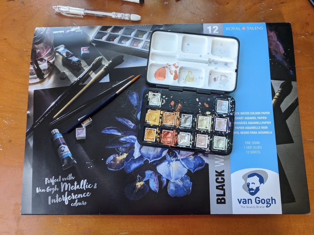
Due to my ongoing obsession with black paper, I decided to give a new brand (to me) a try Van Gogh watercolors. I picked up the Specialty Set of Metallic and Interference Watercolor (I paid $55, but its $45 at Cheap Joe’s right now) and a 16.5” × 11.7” black paper pad ($25). Made by the Dutch company Royal Talens. Van Gogh is their “student and artist” line.

I can never remember to take photos before I start using a new set.

I am generally not a fan of student grade watercolors with a few exceptions. Many are so low pigment and so tricky to work with it can take the joy out of a painting. While others are fine for practice if you don’t need your piece to be lightfast. I have student grade paints I use for pieces I intended to scan and turn into digital art because, for that purpose, lightfastness is moot. Outside of that, I generally tend to stick with professional-grade paints. But, the Rembrandt Special Effects pallet is very expensive at the $100 price point and did not seem worth the investment for what amounts to experimentation on my part at this point. But, I am contemplating picking up the Rembrandt specialty colors in tubes, especially the glass-based paint in the future, which seems to be a better value than the set.

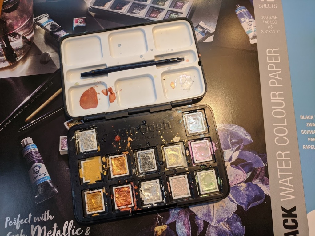
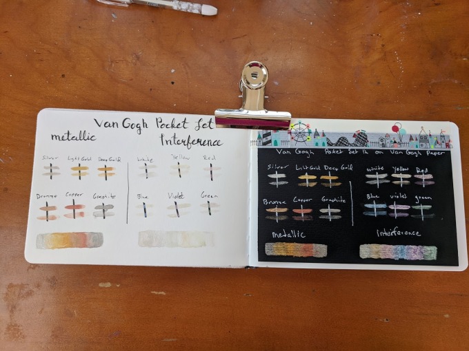
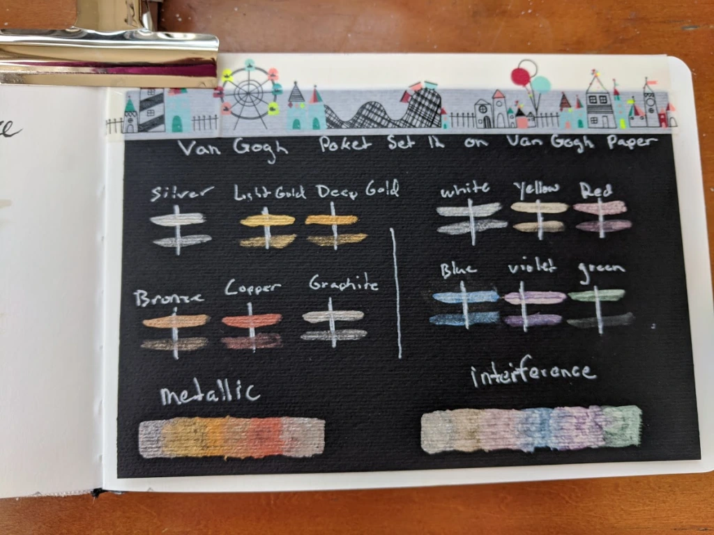
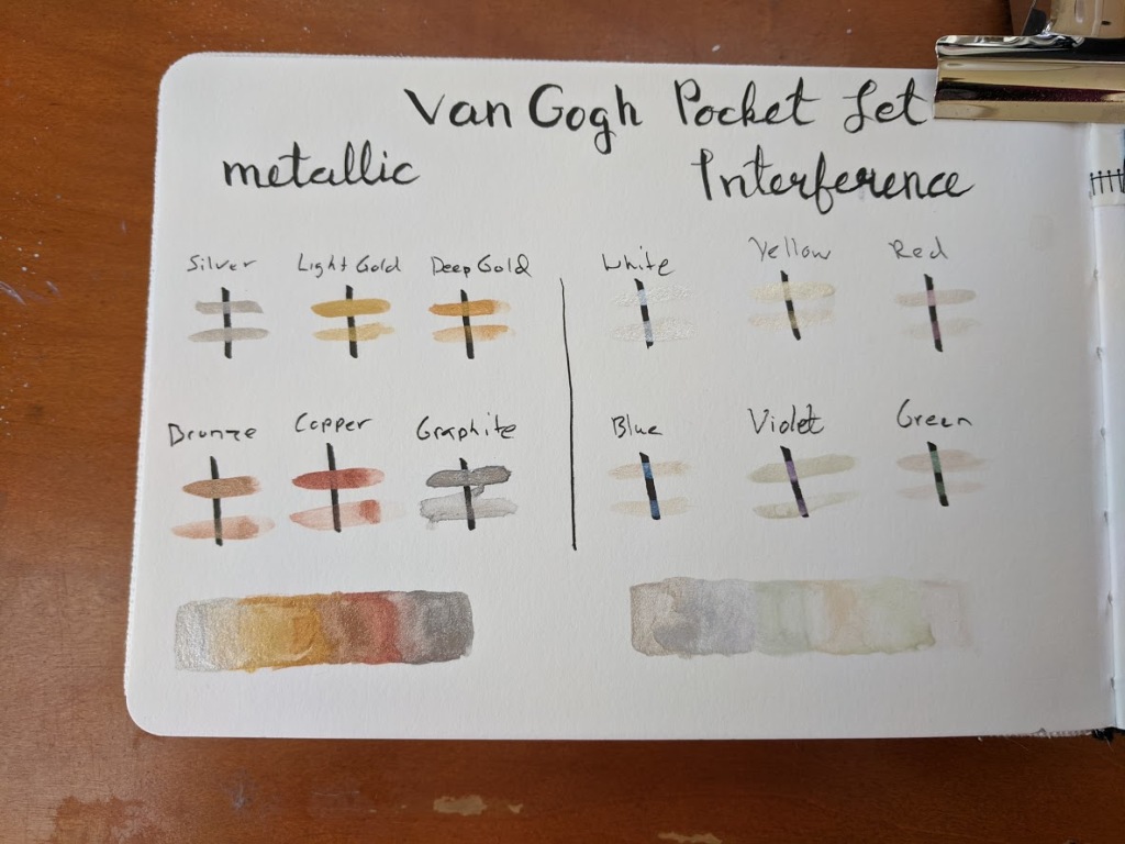
The Van Gogh set comes in a plastic box with a mixing palette and a travel brush. The pans are removable and come individually warped so you can order refills of your favorites. I know, given this is a student grade, I should expect plastic, but I find this kind of plastic case hard to travel with as I can’t use magnets to hold the pans in place nor the clips you see in some metal cases. I like that the case is black, but I wish this was also true for the included mixing palette, which is white. It is tough to see the colors of the interference paints on white.

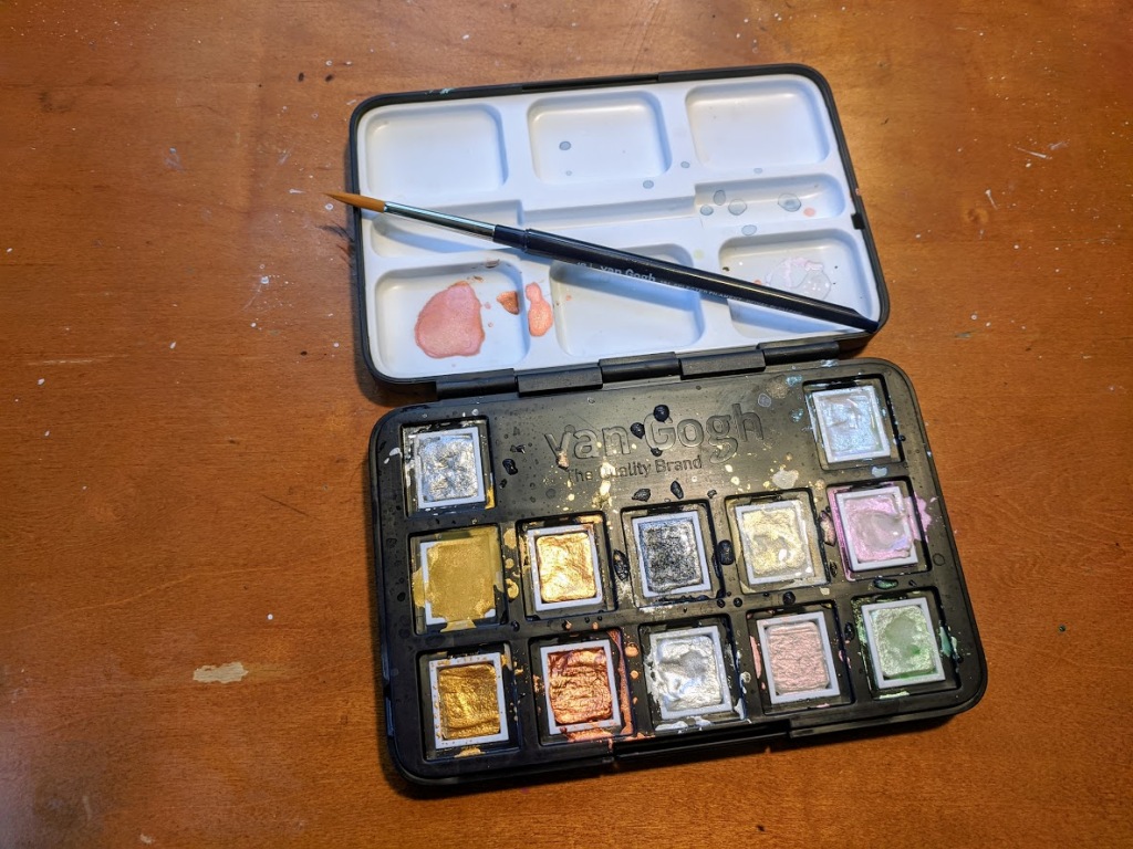
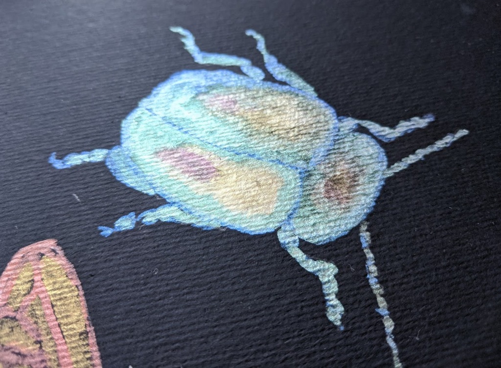
For student grade paints, these are relatively pricey, but I think they are good quality student paints. I would put the metallics on the same level as the beloved Finetec brand for opacity. They would make excellent brush calligraphy paints. The interference behaves differently than I was expecting. I have used interference acrylics before, and the color shift between colors when viewed from different angles. The mic coated particles shift between an opalescent color and its complement. Such as red to green or yellow to purple. The watercolor Van Gogh interference paint shifts from white to colored. But are still very pretty, and I can see applications for feathers, scales, and other iridescent features. The interference paints really pop on black paper and give subtle sparkle on white. They do not scan well, however, and the camera really does not do them justice either.


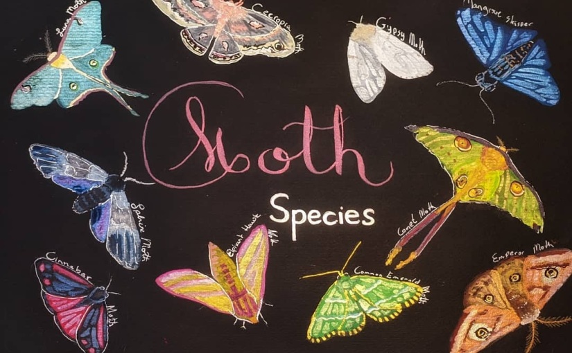
I decided to try to paint an illustration with just this set, which was rather tough, and I did end up falling back on my white and black pens for details after.

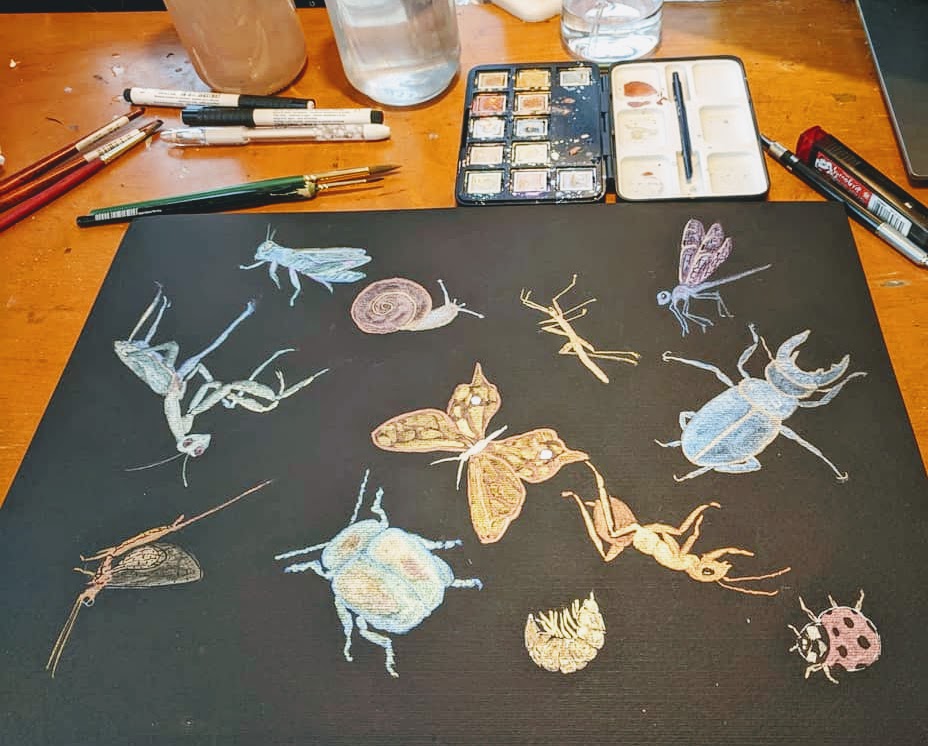
They worked much better for me as part of a mixed media piece with gouache, ink, and Finetec watercolors.

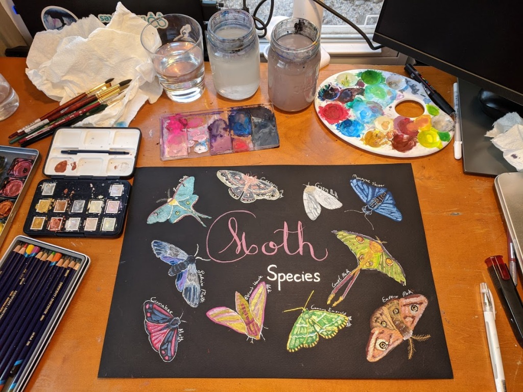
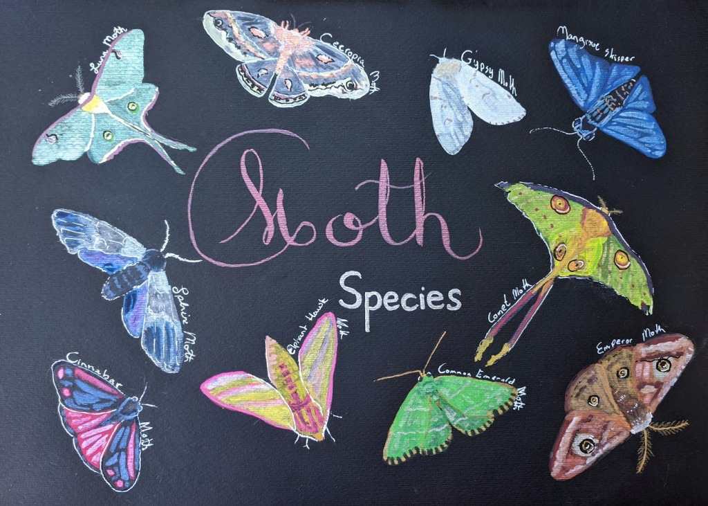
As for the paper, it is 140 lbs and is a reasonably decent watercolor paper. It will only buckle if you get it sopping wet but will then dry flat. It works excellent for brush calligraphy and illustration. The only drawback is both sides are rough, so for dip pen calligraphy, the Stonehenge pad is a better option. Overall I would say using these supplies was a pleasant experience, and I will defiantly experiment with them more in the future.

Happy Art Journey,

Justine

Hushwing Dot Card Review

The last half-decade has seen the launch of several boutique watercolor paint business run by artisans. Some of these boutique watercolor paint makers utilize hand mulling, high pigment ratios, and ‘natural’ ingredients to differentiate themselves from the big paint makers. As a result, many are offering unique, handmade, and exceptionally high-quality watercolor paints.   I have been following some of these watercolor paint artisans via social media over the last year Hushwing, Greenleaf and Blueberry, Letter Sparrow, and Pfeiffer Art Supply to name a few. Many of these businesses carry hard to find pigments or have a unique focus to their paints. For example, Hushwing has a focus on North American earth pigments, Greenleaf and Blue Berry features Gemstone and Aztec pigments,  Pfeiffer Art supply offers a bird themed collection with non-toxic pigments.

Last month I ordered a dot card from Hushwing’s Etsy Store to give their paints a try. Overall it was really a lovely watercolor experience. The dot card arrived carefully and elegantly packaged in nested envelopes. The inner envelope was a striking dark blue color sealed with wax. Everything about the presentation says ‘slow and careful preparation’. The dot card its self is a nonabsorbent type paper possibly YuPo rather than traditional watercolor paper.  I appreciate this as it enables the customer to use the dot card more like a mini paint palette mixing the different pigments without the paint seeping into the paper. I was able to paint a small trial painting which I think gives me a better idea of the paints’ features and quality.

Hushwing Watercolor Paint Dot Card

I picked up the Hushwing Collection which is a mix of earth and one modern pigment including Colonial Yellow Ocher, Colonial Raw Sienna, Colonial Burnt Sienna, Colonial Red, Colonial Violet, Colonial Raw Umber, Colonial Burnt Umber, Cyprus Green Earth, Cyprus Jarosite, Prussian Blue. The earth tones and muted colors of this pallet lead themselves well to forests, mountains, and fields. Making the collection an excellent en plein air (out in the open painting) set. I would like to pick up this set in the near future for summer travel.  Each pigment is hand muled and bound with gum arabic and honey. The Colonial paints are earth pigments from North America. Cyprus Jarosite is an earth pigment that originates naturally from Cyprus. While Prussian Blue is a modern pigment although it dates to 1700s dye makers. Full pigment descriptions are available on the Hushwing Website. This dot card contains my favorite Yellow Ocher and Raw Siena I have used so far and I would buy a set for just them. The Prussian Blue is also exquisite, deep, dark, and intense. The Colonial Violet is a lovely earthy muted purple. Each paint has a very high pigment to binder ratio. I found myself needing more water than expected to dilute the paints to make gradients. The website states Hushwing has a 50/50 ratio which I believe.  Each dot rewetted readably. Paints lifted off the paper well when I wanted to add highlights. Overall it was a very enjoyable set of paints on the card.


Hushwing paint is not low cost which is why I started with a dot card. However, this is to be expected as the artisan Kirsten Cooner needs to recoup the cost of supplies and her time while making a profit that one could live on. Becuase, of the high quality of the paints her production cost is likely high in both money and time. She is clearly not skimping by using more binder, cheaper pigments, or any of the other tricks watercolor producers use to lower production costs. Additionally, the website describes a laborious process of hand mulling and hand poring in thin layers.  A set of ten half pans currently costs $110 and the seven half pan Colonial set is $70. However, at about $10 per a half pan, this is similar to pricing for Schmincke ($7 to $13) the best-known mass-produced premium watercolor paint. Keep in mind I am not a pigment expert and I am an amateur artist. That said I did like using Hushwing paints more than the ones in my Schmincke set.  Hushwing is by no means a necessity but would be a very nice luxury item to have.