Festive and Naughty Reindeer

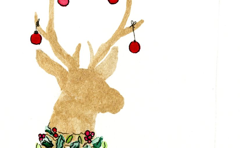
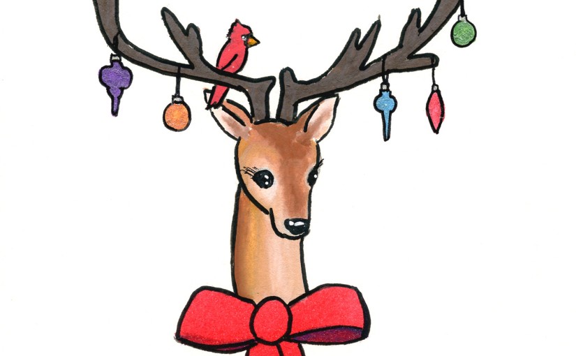
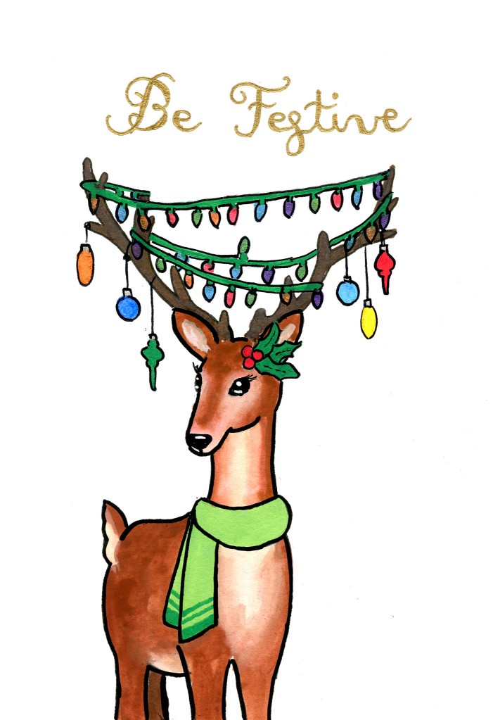
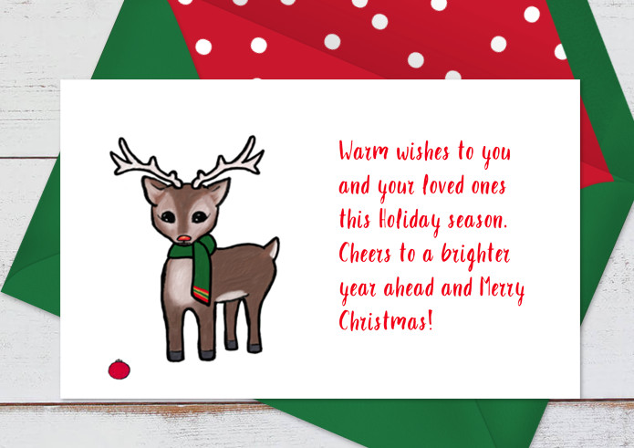
Here are some of the reindeer cards I mentioned in my previous post. I have relied on Posca Paint Pens for these illustrations but I also utilized metallic markers in Prismacolor Premier seventy five set. I wanted to give the impression that the deer enjoyed the festivities themselves, perhaps even taking it a bit too far. I wanted the look to be happy and goofy. I had seen other illustrations of deer with decorations in there antlers and thought that was a fun look so I started there.

Festivities for All!
Bad Reindeer

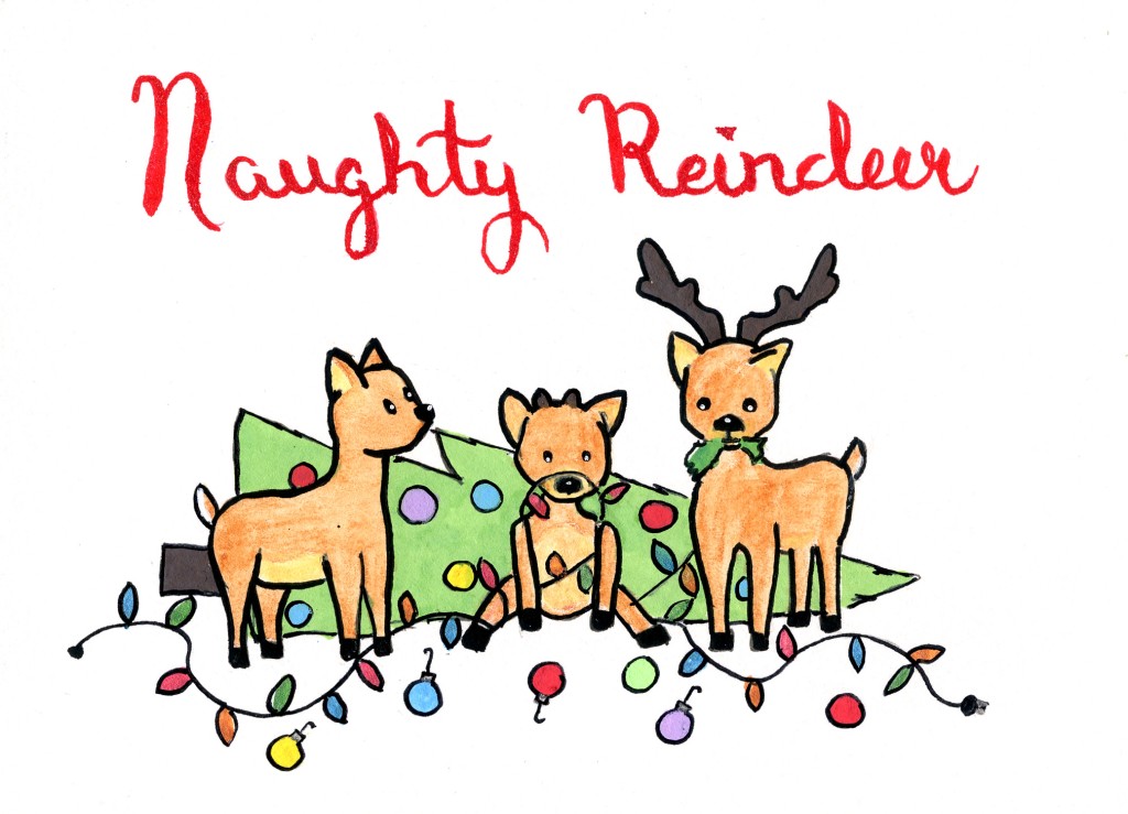
This eventually lead to the idea of reindeer being naughty with their fun like a cat or dog knocking over the Christmas tree. I was inspired by a meme of a cat owner who had tied down their tree to cement blocks…

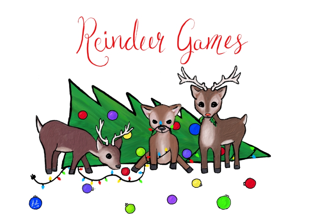
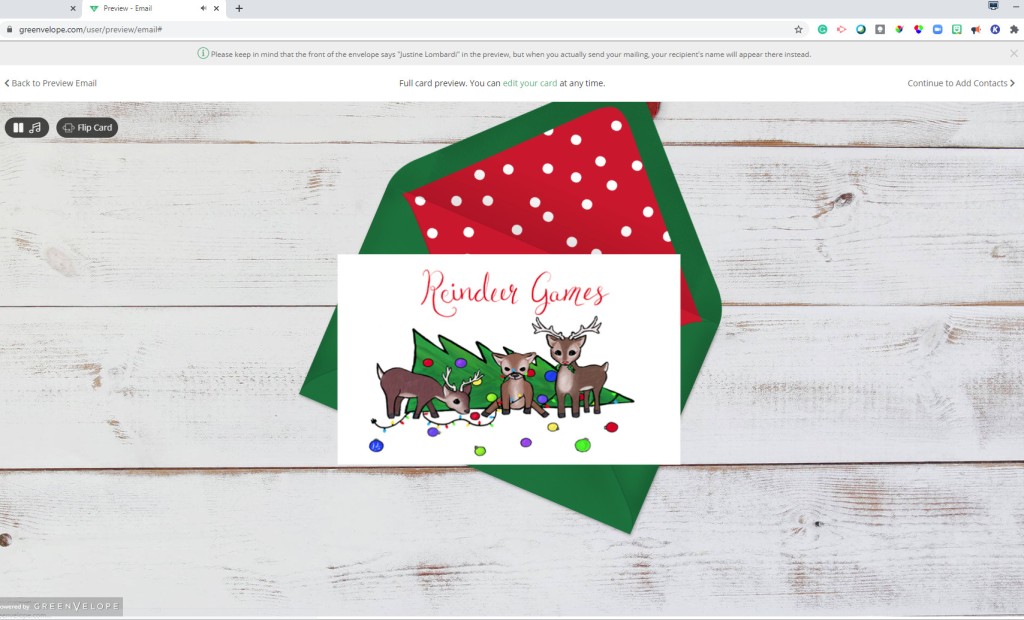
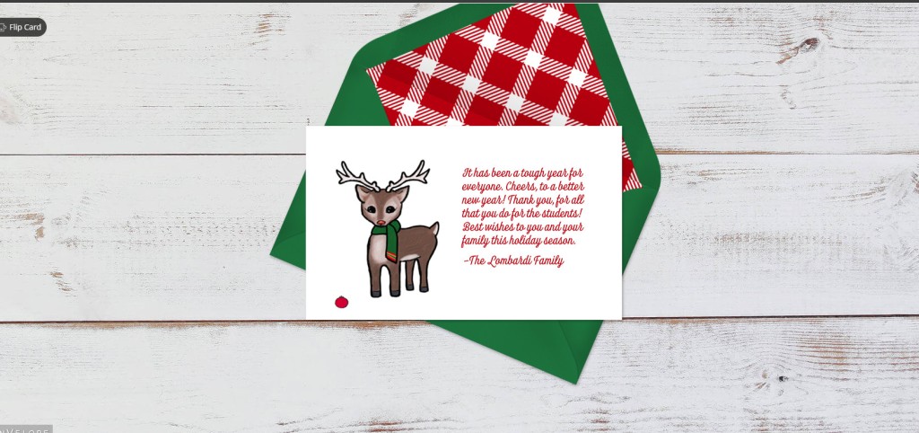
I am currently working remotely, so I created a digital image in Adobe Fresco, which I upload to Green Envelope to digitally send to my coworkers. The illustration is my first try at creating something in Fresco. The live brushes are quite a neat experience and help create images that look shockingly like traditional media. However, it did take me a while to figure out the controls.

I like Green Envelope. You can use their designs or your own, customize the envelope, even upload some music to the opening animation! It worked great and for sending something to my sons’ teachers as their school went full remote for the remainder of the year. I was even able to attach a Starbuck gift card!

Merry Christmas and Happy New Year!

Justine

Cosmos Christmas Cards

This year I made mostly stary Christmas cards. Nebula, galaxies, and the Milkyway are fun and easy to make utilizing wet on wet watercolor techniques. I find them delightful to view.

I am very fond of the work of Carl Sagan a science communicator best known for the Cosmos: A Personal Voyage documentary series of the early ’80s. One of the first to broadcast on PBS. He is often quoted as saying we are the stuff of stars. The idea being we are made of the atoms born out of supernovas. A supernova explosion occurs out of the death and collapse of certain stars. Many of the heavy atoms found throughout the interstellar medium are formed in Supernova. This is where the atoms that build our bodies come from. So we are literally created out of stars. I find this and the idea that even the stars in the sky are born, live, and die humbling and inspiring. More on this concept can be found at CNet’s article: ‘We are made of star stuff’: A quick lesson on how

For two of my cards I utilized:

“The cosmos is within us. We are made of star-stuff. We are a way for the universe to know itself.”

and

“The nitrogen in our DNA, the calcium in our teeth, the iron in our blood, the carbon in our apple pies were made in the interiors of collapsing stars. We are made of starstuff.”

I designed the cards to look like a nebula inside of a Christmas tree ornament. Two of which have the famous quote around the outside of the ornament with the complete quote on the inside of the card.

Cosmos Christmas Card
The cosmos is within us. We are made of star-stuff.

Cosmos Christmas card 1
We’re made of star stuff.

I made additional nebula cards in Christmas colors as well. But, without the famous quotes. I am still working on my hand lettering so that is not quite where I would like it to be. But, am happy with the little nebula.


Have a happy holiday season,

Justine

Spectrum Noir Glitter Brush Winter Warmers Set Review

As I mentioned in a previous post I had recently purchased the Spectrum Noir Glitter Brush Winter Warmers set. To create red holsters on reindeer cards.  Here is my followup review of the product.

Spectrum Noir Sparkles Packaging

The markers come in quite a few colors in packs of three and twelve. They are a bit bigger than the Wink of Stella brush markers.  There is a rather extensive Christmas set with colors like “Rudolph’s nose”. The set I bought had vibrant colors Starry Sky (blue), Red Berry, and Holly Leaf. They create very sparkly marks in person but be sure to shake them well to maximize the effect.  My three pack was $17 at Hobby Lobby so they are not cheap. But, they seem to have lots ink and will last a while. They are waterbased so use them over other applications as they will smudge if you try to watercolor on top. However, I was able to write over top of the dry ink with an alcohol-based marker with a fine tip.

Spectrum Noir Sparkles Winter Warmers Swatches

They make great brush calligraphy but don’t work very well for painting. It is difficult to get a flat wash with them as you can see with the top image. But, they are meant more for crafts and they fulfill this role well.

You can squeeze the markers a bit for extra ink on the brush end and spaltter the ink as well.

Joy and Ornaments
Spectrum Noir Glitter Brush Winter Warmers and Molotow Liquid Chrom marker.

I did try to add them for details on a couple of small watercolor paintings. I used the red for cardinals and the green and blue for plant details.

I don’t regret my purchase at all as they did a great job at what I wanted them for red sparkly reindeer holsters. But, I don’t know what to use them for other than Christmas cards.

Reindeer Christmas Card

That is all I have now.

Happy Art Journey,

Justine

Kuretake Gainsay Tambi Starry Set Review and Christmas Cards Part II

As I mentioned in a previous post I plan to spend my spare time in November making watercolor Christmas cards. I have wanted to pick up a Kuretake Gainsay Tambi Starry Colors watercolor set for a while and Christmas cards seemed like the perfect excuse. This is an affordable set at $12.00. The Kuretake Gainsay Tambi Starry Colors set contains six mica based watercolors five golds and one pearl. They come packaged in cardboard each paint is held in an individual pan. You can leave them in the original box or pop them into your preferred pallet. But, they are larger diameter than most pans.


The paints range can be quite opaque to semi-transparent depending on your water dilution.  They show well on both white and black paper. They should work really well for creating gold accents and gold brush calligraphy. The six colors are blue gold (no. 901), red gold (no. 902),  yellow gold (no. 903), champagne gold (no. 904), light gold (no. 905), and white gold (no. 906). The white gold looks more like a pearl to me. I am just in love with the champagne gold (no. 904). They do seem to be a bit tough to get going. They do not initially absorb on to the brush well. I did get good results by dropping water on the pans, letting it sit a moment, and then lifting with my brush. 

I have not gotten much time to play around with them yet. But, here are a few ideas I put together quickly last night.


I am looking forward to painting with these more and hope to post some more card ideas soon. I do wish Kuretake would offer a silver or platinum set now that I have seen what they can do for gold watercolor.

Happy Art Journey,

Justine